
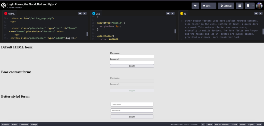
Here are a few login forms. There is the default, a poorly contrast and a better designed form. The first one is OK, it is easy to see. Its functional but not so amiable. This may be a bit jarring due to it’s imbalance.
The second example I come across frequently. The form tend to blend with the background. Many feel that a lower contrast form is less jarring, there is the tendency to go overboard. The form fields are very tough to see, and can be challenging for those with visual impairments. However, the blue default border will appear after the form field is clicked.
The third example is more moderately contrasted. This has numerous benifits, sucha as reduced eyestain and maintains a clean, professional and inviting aesthetic.
Other design factors used here include rounded corners, also easier on the eyes. Instead of label, placeholders are used. This reduces clutter and saves space, especially in mobile devices. The form fields are larger and the fields and log in button are evenly spaced, provides a cleaner, more consistent look.